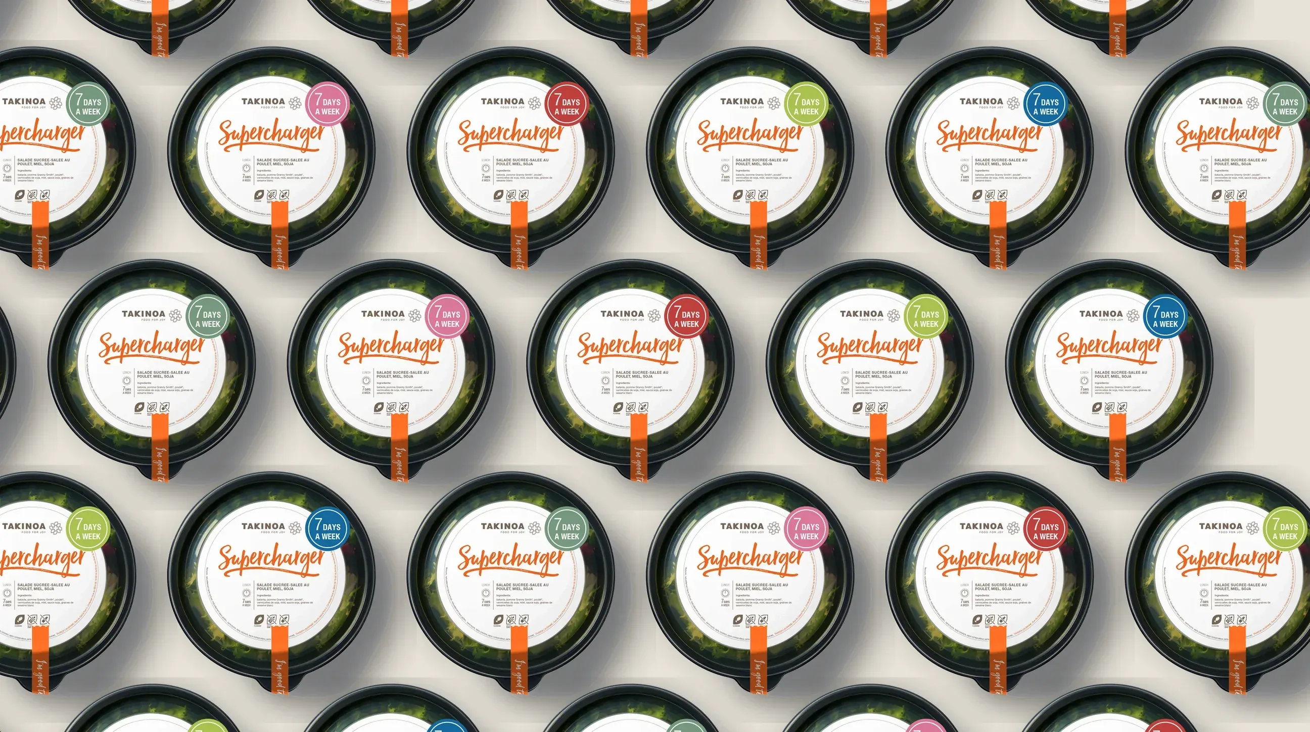
Takinoa Food
Building a packaging communication system for a healthy food brand.
Takinoa is a healthy food brand focused on making nutritious eating accessible, transparent and enjoyable. As part of a broader brand communication project, I developed a packaging communication system that organised nutritional information, ingredients and product categories across the product range.
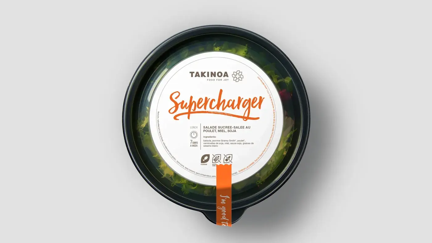
Making healthy choices easier
The goal was to make products easier to understand while supporting the brand’s focus on transparency. The packaging became the main source of product information.
A clear visual hierarchy, icons, colour coding and modular layouts helped customers quickly compare products and find the information they needed.
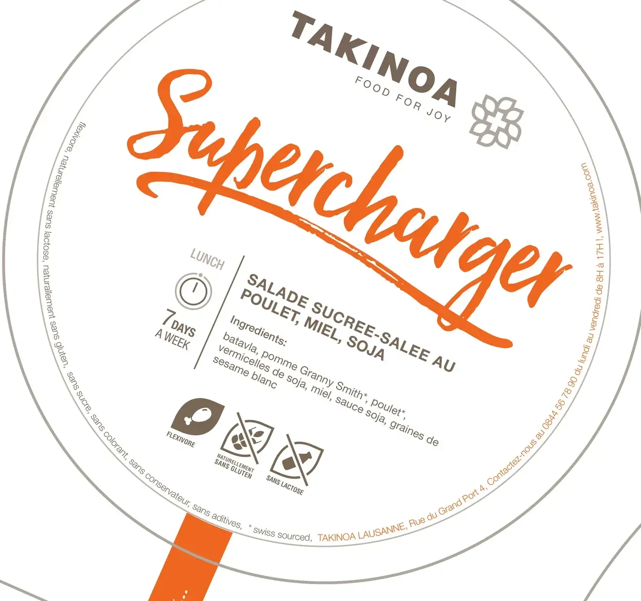
Information system
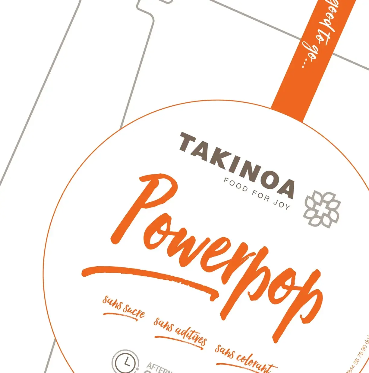
Every pack carries the same elements in the same places. The lid leads with the product name, then the time of day and the meal it suits, the description and the ingredients, the dietary icons, and around the rim the shop, contact and website details. The pot repeats what the law and the shelf need: the best-before date and the claims, with a Takinote card for a word to the customer.
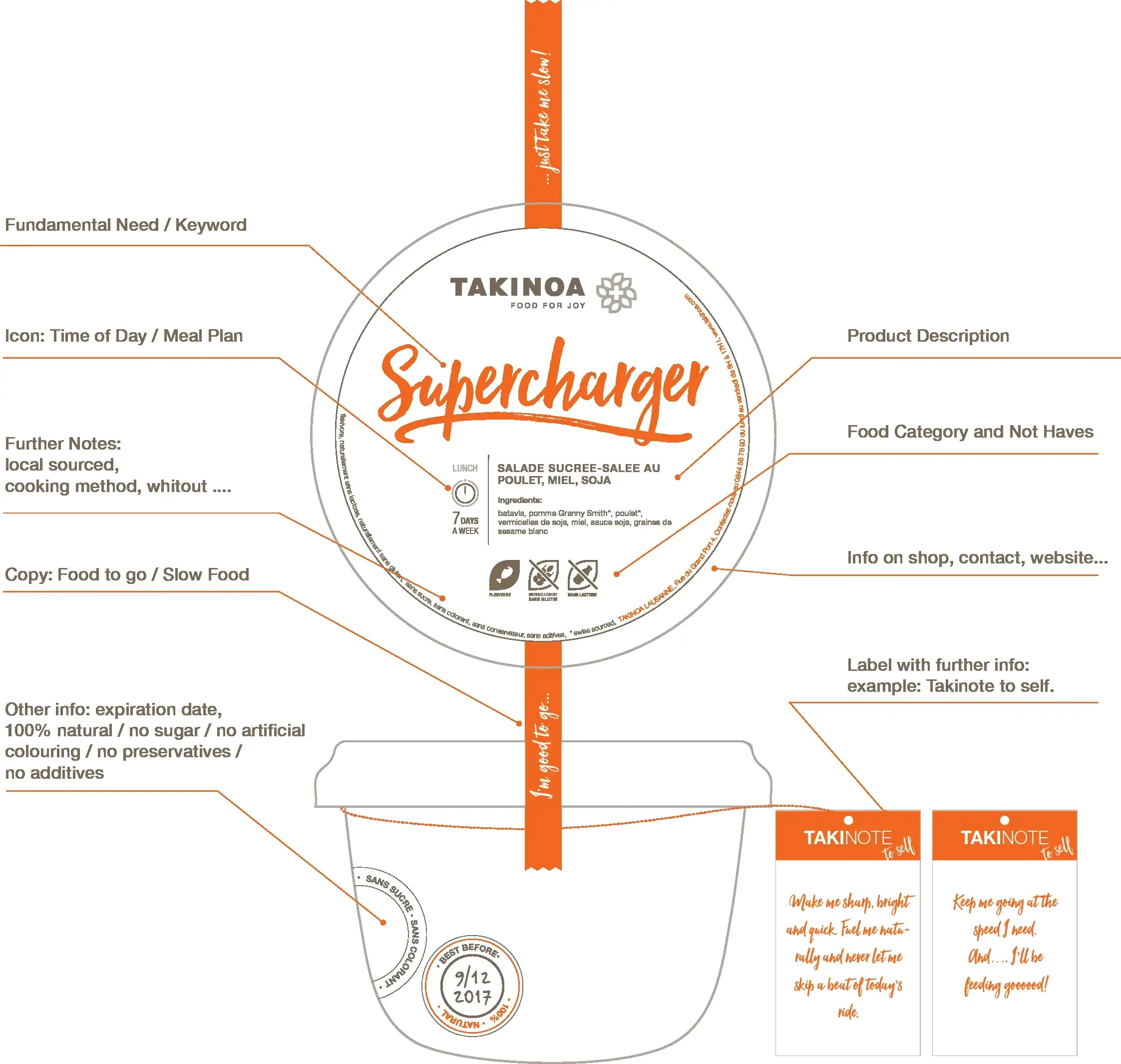
Packaging across the range
The system was designed to scale across multiple product categories while maintaining a consistent information hierarchy.